Kim Padan: Pro-Life Speaker

Sunday, May 29, 2011

Stampin' Sunday!!

(Note: Blogger is giving me fits! I was unable to link all of the challenges today...I'll try again tomorrow.)
Hello Stampin' Friends!
Sunday is a day of rest...and for me, that means playing with my inks and stamps! No laundry, no dishes, just play!! I decided to catch up on a few challenges from SCS. This post could get long!
First, I made this card yesterday for the Inspiration Challenge found here. The inspiration site had party supplies, and I was captivated by this colorful napkin. I used naturals ivory for my card base. My scallop trim punch got a workout with some scraps in melon mambo, rich razzleberry, cajun craze, tempting turquoise, and old olive. Some of the scraps were already embossed. The medallion image is from the Artisitic Etchings stamp set, colored with markers. The sentiment is from On Your Birthday, and that other detailed stamp is also from Artistic Etchings. I added 2 bands of scrunched satin ribbon. Overall, a very different look!
My next card combines this week's Color Challenge (baja breeze, soft suede, and perfect plum) with today's Featured Stamper Challenge. I chose this card to CASE. The card base is textured soft suede, and I added 1/2 a top note die piece of elegant soiree dsp. I brought out my recently retired Sale-a-Bration set "Bliss" for these wonderful butterflies, popped up with dimensionals. The sentiment is from Because I Care, a Hostess Level 1 set, stamped on vanilla and cut like a banner. Baja seam binding and plum flower brads finish it off.
Catching up with my beloved color challenges...here is one with regal rose, rich razzleberry and very vanilla. I had not used regal rose in months, and now I have used it twice within 10 days! I was truly at a loss...but I opted for this simple and quick sponged look. I ran my vanilla card stock through the big shot with the elegant lines impression folder, then sponged the two bright colors right over the surface. I added lots of rhinestones to make it very girlie! The sentiment is from Just Believe, and it is layered on the modern label and scallop oval punches.
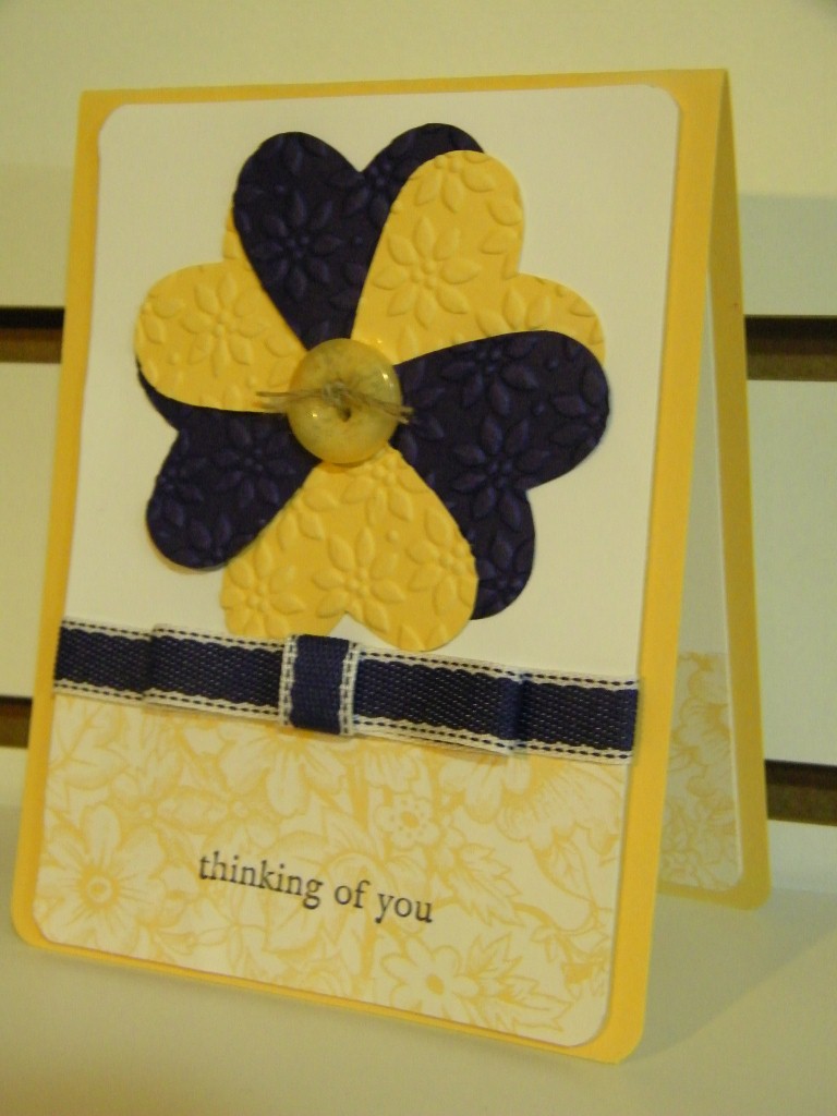
The next color challenge (actually, going backwards!) features so saffron, certainly celery, and blushing bride. A young woman from our church is getting married this summer; her bridal shower is in 2 weeks. Her colors are muted pinks and greens, so I decided this combo would work. I got this Blissful Bride stamp set in that online auction back in March. Perfect! I stamped it with basic black ink, then used my markers to color the sash and flowers. The sentiment is from Teeny Tiny Wishes, punched out again. Finally, I added some retired saffron ribon and basic pearls.
My last card is not a color challenge! It's Friday's Free 4 All, hosted by my friend Dawn. We could post anything, any theme, color...just had to include something we got for free. I got these bright brads and ribbon from my friend Kathy last summer. I brought out retired card stock in yo-yo yellow, pink passion, and only orange. I wish I had stamped 4 flowers...kinda planned just one brad to off-set, but then the squares are so small, so I added the center punched flower. Oh well...it's bright and fun!
Now I have to clean up my mess so I can stamp more tomorrow!!
Inky {{{HUGS}}}

Saturday, May 28, 2011

Belated Friday Mashup!


Well here I am! The fund raiser in Chicago was great...then Bruce and I spent all day Friday at Navy Pier. We came home exhausted, but then I was ready to stamp! Hope to crank out a lot of cards this weekend!
Here is my Friday Mashup card...
I used the colors but left one detail off the sketch. Oops! These colors were an unexpected combo for me...but I love them together! The subtles look great on a regal background! I started with a navy card base, then used 2 sides of a sheet of pretty in pink pattern paper from the subtles paper stack. I outlined the horizontal band with my pear pizazz marker to add some contrast. The flower image is from Elements of style, colored with markers, stamped on whisper white, then punched out with my extra large scallop circle punch. I popped it up with dimensionals on a circle of Greenhouse Gala dsp, cut out with my circles die and the big shot, and that is popped up too! The bird, also from Elements of Style, is stamped in night of navy, and cut out, the popped up with 2 dimensionals so he is suspended over the flowers. I added a Teeny Tiny Wishes sentiment on a scallop oval, sponged with navy ink. Accessories are the basic pearls and pear pizazz twill ribbon. My corner rounder punch added the final details.
Don't forget, you can play along too! Check out the Friday Mashup challenge here!
Inky {{{HUGS}}}

Friday, May 27, 2011

Friday Mashup! Well, sort of...


Hey Stampin' Friends!
I flunked time management this week after conference! Last week's cards were pre-posted, even Wednesday's card was pre-posted. But I didn't get my mashup done. I am typing this Thursday afternoon...and I will be headed to Chicago within the hour for a fund raiser. So, I'll play along later this weekend.
But YOU can beat me to it! Check out the Friday Mashup challenge here. It's a great sketch with a fun color combo! Do the sketch...use the colors...or mash 'em up together!! Who knows...I may just wanna CASE one of you!!
Inky {{{HUGS}}}

Wednesday, May 25, 2011

Dare to CASE my Hubby!!

It's Wednesday, and you know what that means...time for another Color Dare!! Riley gave us a 2 color combo...So Saffron and Concord Crush, plus a neutral of our choice. Hmmm. I actually struggle with just 2 colors. I kept looking at images that needed some green or some blue or some red. I was stumped.

Now, as a Design Team member, I receive these challenges in advance. I told my husband that I had to make a card with "purple and yellow and a neutral." I didn't go into detail...he doesn't know the difference! Well, it was the Saturday before Mother's Day, and I had lots of retired card stock out for a play day at my house. The next morning I heard funny noises. Turns out, my husband was making a Mother's Day card for me! Here is what he came up with:

How sweet is that? I was so impressed that I told him, "I am going to CASE you!" I absolutely LOVE his flower made from hearts, so I took that inspiration and this week's colors and created this card.
I started with a so saffron base, and added whisper white and some retired DSP on the front and inside. I rounded the corners to go with the hearts. My heart "petals" were punch out then embossed with the Petals a Plenty impression folder. I added a subtle brad in saffron and some linen thread to the center, adhered with Tombo mono-multi liquid glue. The sentiment is from Three Little Wishes, stamped in concord crush. The poly-twill ribbon in concord crush adds the final touch.

I think this flower idea is fantastic...and I will use it again, I'm sure!

Can't wait to see what YOU create for Color Dare #102...be sure to use keyword CD102.

Inky {{{HUGS}}}

Friday, May 20, 2011

Friday Mashup! Ribbons and Pearls, and all things Girls!


Hello, and Happy Friday! It's time for another Friday Mashup challenge! Today, we are taking a complete 180 degree turn from last week. That monochromatic masculine challenge was tough...today we get to use girlie stuff!! Ribbons! Pearls! Anything for girls!

I decided to pull out a retired, but all-time favorite stamp from Summer by the Sea. This little girl is precious, and fun to color. I stamped the image in stazon black on SU watercolor paper. I then used my aqua painter to watercolor, grabbing colors from my ink pads. The colors used are blushing bride, perfect plum, blush blossom, so saffron, baja breeze,and pear pizazz. (The blush blossom ink pad is retired, but you can get that color in a marker.) I mounted the image on some baja breeze card stock, then layered on some blushing bride dsp from the Level 1 hostess pack, all on a blushing bride card base. Using my baja breeze marker, I colored some basic jewel pearls. Make sure you let them dry a long time. I actually have a sheet of pearls in various colors for future use! I added some certainly celery satin ribbon; my usual knot got in the way of my pearls, so I changed it up to a faux bow. Teeny Tiny Wishes and my punches finishes this off.

Now...I wanna see what YOU create! Make sure you use the keyword MU07 in your blog or online gallery.

Inky {{{HUGS}}}

Wednesday, May 18, 2011

Dare to Put a Twist on some Classics!

Hello and Happy Wednesday! It's time for another Color Dare! This week, Riley has us using a twist on the classic pink, green, brown scheme for CD#101: Regal Rose, Old Olive, and Early Espresso.


Now, truthfully, I rarely use regal rose. In fact, I probably use it less than any other pink. But oh my, with this early espresso, I love it! I will be using it more now, for sure! All of my products here are from Stampin' Up! I used an early espresso card base, and added a large layer of regal rose, embossed with the vintage wallpaper folder in my Big Shot. I rounded 2 opposite corners just for a simple detail. The layer is embellished with striped grosgrain ribbon and a large antique brad. The whole layer is popped up on dimensionals. The main image is from Style Beautiful...a new set for me. I stamped with my early espresso craft ink spot on very vanilla, then heat embossed with clear embossing powder. I used my blender pen to color in the image with the old olive and regal rose ink pads, then added a layer of old olive card stock. The sentiment is from You're a Gem, and it fit perfectly in my 1" circle punch! I sponged it lightly and popped it up with a dimensional. I still needed just a little something, so I added 3 basic jewel pearls. Love the contrast on the dark card base!

For the inside, I used my markers to color a sentiment from On Your Birthday and the corner image is from Style Beautiful. I meant to use my regal rose marker on the verse. Oops. Not re-doing it!

Hope you enjoy this color scheme...Join us and upload your beautiful creations! Be sure to use keyword CD#101.

Inky {{{HUGS}}}

Tuesday, May 17, 2011

Happy 50th Anniversary, Bill & Claire

I have been prepping for a conference workshop, and will be out of town for a week. But in the midst of prep, I realized that 2 of my best friends have a 50th wedding anniversary party the day I get home! So, before I left town, I looked at Saturday's Inspiration challenge from SCS to get me going. The inspiration site was Doodletart Glass, and I found this lovely piece.

I used sahara sand, basic black, whisper white, and very vanilla card stock. I cut out stem and flower fusion sizzlits, then taped them down on the black, and finally ran it all through my big shot, de-bossing with the vintage wallpaper folder. Gold glimmer brads and gold cord go with the 50th theme. I also added some white organdy ribbon. My Teeny Tiny Wishes was out on my table, so I grabbed it again!

I'll be away from my stamps for a week...but I have some blog posts in the wings. See ya soon!

Inky {{{HUGS}}}

Saturday, May 14, 2011

Summer Mini Club Projects

Hello Friends!

It has been a busy weekend! At work this week, I signed lots of receipts and pledge letters for our fund raiser. Did I ever tell you how it went? It took a couple of weeks for pledges to be entered into the computer...but here we are. The goal was $80,000 for operating expenses...but the pastor giving the appeal challenged us to stretch to $100K to prepare for growth. Well, we reach $123K...WooHoo!! Praise the Lord!

On Friday night, I had my Stampin' Club. We made 2 projects, both using products from the Summer Mini catalog. My first card is a complete CASE of this card from my cyber friend Wendy. It was nice to have someone else do the design work! LOL!! The card base is early espresso, and I added a nice striped pattern from the Nautical Expedition DSP. Another pattern was used for the 1/2 scallop circles on the left. I stamped the compass from The Open Sea stamp set in early espresso on cherry cobbler card stock. The ship is stamped with not quite navy ink on whisper white layered on espresso. I used my ticket corner punch for a simple detail. I added some cherry cobbler bakers twine, then added a sentiment from Teeny Tiny Wishes on the modern label and scallop oval punch.

The second card is bright and feminine. The card base is melon mambo. I stamped versamark on whisper white. I first stamped the sentiment from All Holidays, and coated it with the new wild wasabi embossing powder. After I heated that, I stamped an image from Fifth Avenue Floral, then used the melon mambo embossing powder. I finished the card with a strip of Beyond the Garden dsp and some daffodil delight satin ribbon.

Like what you see? You can get these products by checking out my Stampin' Up! website...just click here!

Now, I have to finish my power point presentation for a conference this week! Yup, I have been busy! But it's all good stuff...busy blessings, I guess you could say!

Inky {{{HUGS}}}

Friday, May 13, 2011

Friday Mashup! Monochromatic Man


Well, Blogger was down a lot yesterday and this morning...and I worked all day...then had club tonight! I better hurry if I want this posted actually ON Friday!! LOL!!

Kasey presents us with a tough challenge...well, for me anyway. Create a monochromatic card, or a masculine card...or Mash it Up by making a monochromatic masculine card. Guy cards are so tough to make, aren't they? (Please tell me you agree!) I actually made 2 previous cards, and I wasn't thrilled with them. One may make an appearance some day...the other will never be seen in cyber space if I can help it! I finally came up with this card:

I have been making so many nautical projects lately that I needed to stretch myself. This card has a neutral theme more than a specifically masculine theme, but I did send it to a man! Our board president did a bunch of tech stuff for our recent fund raiser, and he appreciates my hand crafted cards. I started with an always artichoke card base, which I ran through my Big Shot (just the front) with the square lattice impressions folder. I added a layer of old olive...then stamped the retired French Foliage in shades of green: always artichoke, old olive, wild wasabi, and garden green on very vanilla. After stamping I ran that through with the same folder. I stamped a sentiment from Three Little Words on vanilla, added the image from French Foliage, then punched it out with the extra large decorative label punch. I added some old olive and dimensionals to pop it up. Finally, linen thread and a chocolate chip button literally wrap it up.

I hope you play along this week...just upload your card to your blog or online gallery, using MU06 as a keyword.

So it's a late post...but the card is actually in the mail! That sounds like a challenge winner to me!!

Inky {{{HUGS}}}

Wednesday, May 11, 2011

Dare to Join the Team!!


Hello and Happy Wednesday!!! I am sooooooooo excited to share some great news: Riley has asked me to join her Design Team for The Color Dare!! WooHoo!! If you have been following my blog at all, you know I participate in her challenges quite often...love her color combos! Plus it's always fun to come up with "daring" blog post titles!! LOL!!

This week's Color Dare is #100...and it's a fun one! Sahara Sand, Rose Red, and Baja Breeze. I was so happy to see Sahara Sand make the line-up...it's one of my favorite neutrals, and doesn't get enough love! I think it is remarkably versatile! I opted to feature polka dots in my card, using it in texture, dsp, and stamps. The main image is from Flight of the Butterfly. Love how this 2-step stamp set works. The wings are stamped in sahara sand,, then the polka dots added in rose red. I stamped the butterfly twice; once flat on the very vanilla, then again, but punched it out and popped up with a dimensional. I sponged the panel with baja breeze, and layered it on baja breeze. The larger layer of very vanilla took a trip through the Big Shot with the perfect polka dots impressions folder. I added some subtles pattern paper in rose and baja...and added the scallop trim detail. Finally, some seam binding was added...I REALLY hope this stuff (which retired in April) shows up in the new Idea Book and Catalog this summer! Love it!

So join us this week with your ideas! Grab your card stock and stamp...can't wait to see what you create!!

Inky {{{HUGS}}}

Sunday, May 8, 2011

Happy Mother's Day!!

Just a quick note to say Happy Mother's Day to all of my stampin' friends out there!! My mom lives too far away (boohoo!), but my mother-in-law is nearby, so we'll be visiting her today. My MIL defies all stereotypes...she is delightful! I am so blessed!

And speaking of blessed...here is a picture of me and my mom:


Have a blessed day! Inky {{{HUGS}}}

Friday, May 6, 2011

Friday Mashup! Embossing Nature


It's Friday, and that means another Friday Mashup! This week we are challenged to make a card inspired by nature, or using embossing (heat or dry)...or combining both.

I need to make some sympathy cards, and I would much rather have them made in advance than feel the pressure to create them quickly. I love sunsets... I love flowers, and somehow, I think they work well together for a sympathy card. I took a piece of Presto Pattern Specialty paper and brayered over it with daffodil delight, pumpkin pie, tangerine tango, cajun craze, and rich razzleberry. I took my chocolate chip craft ink and clear embossing powder, with Inspired by Nature for my main image, stamping both the flowers and the grass. Gets me thinking about my cone flowers which will be coming up in the next few weeks. My sentiment is from Thoughts and Prayers, punched out with the large decorative label punch, and added some espresso brads. I lightly brayered razzleberry over it, then sponged a bit of cajun craze to blend it in with the main panel. Now, the words on this paper are a bit different, so I decided to strategically place my early espresso satin ribbon! I used stick strip to adhere the bow.

The color palette is a bit different...but I love vibrant sunsets with yellows oranges and violets! Now, if only the weather would actually warm up!!

Hope you play along with today's Friday Mashup! Can't wait to see what you create!!

Inky {{{HUGS}}}

Tuesday, May 3, 2011

Color Challenge takes to the Open Seas!

Hello and Happy Tuesday!!

Sort of...my stomach has been bothering me all day! I think my chicken salad sandwich from the deli yesterday did me in! Aack!! I stayed home from work after a horrible night of very little sleep. After getting up around 10:30 this morning, I ate a little and decided I might as well stamp.


Today's Color Challenge on SCS was a classic...basic black, crumb cake, and cherry cobbler. I still need some masculine birthday cards, so I decided to play some more with the Nautical Expedition Suite from the Stampin' Up Summer Mini catalog. I wanted quick, easy designs since I was not feeling so great. My first card features an image on a sheet of Nautical Expedition DSP. It is a large image; I trimmed it down just a bit to fit on a 5x5 square card, made with a crumb cake base. I added 5/8" basic black grosgrain ribbon and basic black brads. I combined the scallop oval, modern label and word window punches in the featured colors with Teeny Tiny Wishes. the entire image layer is popped up on dimensionals.

My second card has a basic black base, and I stamped images from the new set The Open Sea in a random pattern on whisper white. Very quick! I used an sentiment from On Your Birthday and some brads on the large decorative label punch, layered with a bit of crumb cake. It's hard to see, but I added some of the new baker's twine across the middle. Love this new accessory!


I already know that this Nautical Expedition Suite will get a lot of use in my home...my hubby spent 7 years in the Navy, as did one of his brothers and his dad. But even if you don't have any Navy people in your family, this is a fantastic collection of stamps and accessories! Check it out here!

Inky {{{HUGS}}}

Sunday, May 1, 2011

Sail Away with the Summer Mini Catalog!!


Hello Stampin' Friends! It's May 1st...that means the new Stampin Up! Mini Catalog is LIVE!! One batch of items I just had to get was the Nautical Expedition Suite. This card features the DSP and a single stamp called Sail Away, both from that collection. The card base is sahara sand. I stamped the boat in basic black craft ink on whisper white and heat embossed it. The fabric comes from an old denim shirt that I convinced my husband to sacrifice. (I'll buy him a new one!) I ran the denim through my Big Shot with my decorative trim die. I used the denim because this weekend's Mini Virtual Stamp Night challenge #1 called for fabric on our projects. I thought the texture was fun, and the color great for the water on this card. I need some birthday cards for guys...so using Teeny Tiny Wishes and the word window punch fit the bill. Some silver brads add a simple detail...and the main image is popped up on dimensionals.

I'll be playing with more of this Nautical Expedition Suite. Check it out here!!

Inky {{{HUGS}}}